Blender 4.3 workspace
How to Rebuild the Classic Sculpting UI in Blender 4.3
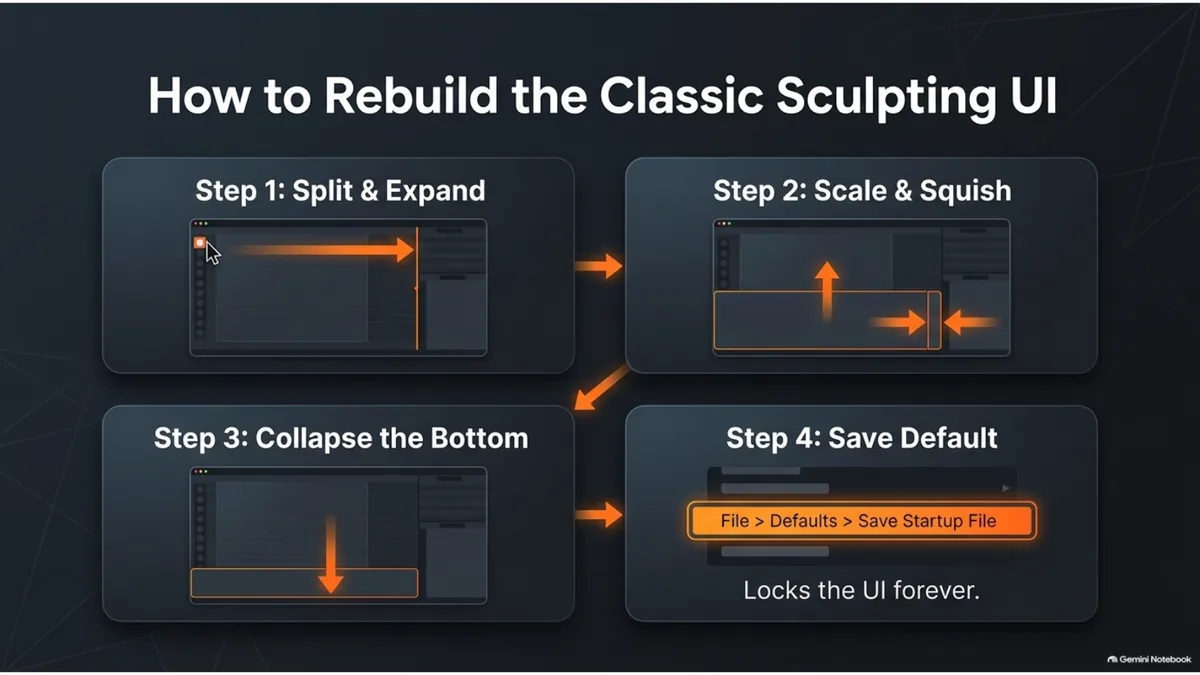
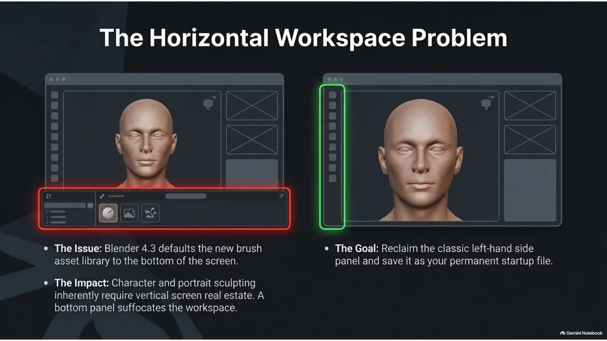
Blender 4.3 can feel less direct for sculptors because brush access is more asset-driven and the default sculpting workspace can spend too much screen height on horizontal panels. You can rebuild a classic-feeling sculpting UI by keeping brushes on the left, protecting vertical viewport space, and saving the layout as your startup file.
Quick answer
To make Blender 4.3 feel closer to the old sculpting interface, open Sculpt Mode, keep the left toolbar visible, reduce or collapse horizontal panels that eat viewport height, keep the Asset Browser in a small side or bottom area only when you need brush assets, then save the layout with File > Defaults > Save Startup File.
This article is intentionally narrower than the general Blender interface basics guide. That page stays focused on the whole Blender interface: viewport, Outliner, modifiers, materials, lighting and first render. This page is only about recreating a sculpting workspace that feels familiar.
Why Blender 4.3 feels different for sculpting
Blender's current sculpting workflow leans more on the Asset Browser and asset-based brushes. That is powerful for reusable brush libraries, but it changes the feel of the workspace if you were used to a compact brush shelf and a tall viewport.
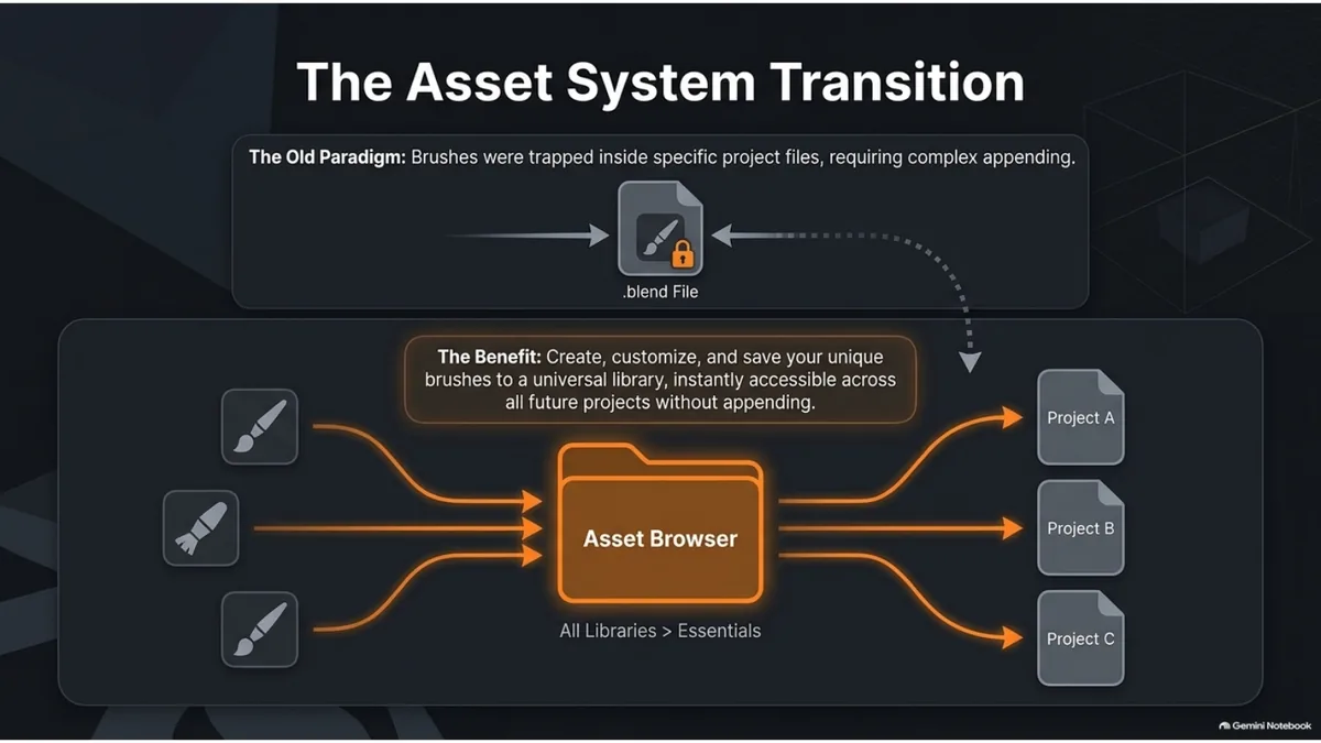
The main problem is not the feature itself. The problem is screen economy. Sculpting needs constant visual judgment, especially for heads, characters and creatures, so a cramped vertical viewport makes forms harder to read.
Rebuild the classic sculpting layout
1. Start from the Sculpting workspace
Open the Sculpting workspace and switch your object into Sculpt Mode. This gives you the correct brush context before you move panels around.
2. Keep brushes visible on the left
Leave the left toolbar open so brush selection still feels immediate. If icons feel too large or too small, adjust the area width until you can read the active tool without stealing too much viewport space.
3. Collapse panels that reduce viewport height
For classic sculpting, vertical space matters more than a permanent wide bottom panel. Collapse the Timeline and keep the Asset Browser compact unless you are actively selecting brush assets.
4. Use the Asset Browser as a library, not the main canvas
Keep custom brushes in the Asset Browser, but do your actual form decisions in the viewport. Open the browser when choosing a brush set, then reclaim the space for sculpting.
5. Save the startup file
After the layout feels right, use File > Defaults > Save Startup File. New scenes will open with your sculpting-friendly workspace instead of forcing you to rebuild it every session.
When to keep the Asset Browser open
Keep the Asset Browser visible while you are testing brush packs, switching between material-specific brush sets, or building a custom library. Collapse it when you are blocking forms, checking silhouette, or doing long sculpting passes where the viewport needs the space.
Where this fits in the workflow
A classic-feeling UI is only the workspace. For actual sculpting decisions, pair it with the essential Blender sculpting brushes guide, the Blender sculpting hotkeys cheat sheet, and the Dyntopo vs Voxel Remesh guide.
If the brush itself is installed but does not behave correctly, use the Blender sculpting not working fixes before changing the workspace again.
Sources and reference
Blender Manual: Workspaces·Blender Manual: Areas·Blender Manual: Asset Browser
FAQ
Can I make Blender 4.3 look exactly like the old sculpting UI?
You can recreate the working feel, but not every old interface detail is identical. The practical goal is a tall viewport, fast brush access, and a saved layout.
Should I remove the Asset Browser from Sculpt Mode?
No. Keep it available for brush libraries, but collapse it when it takes too much room from the viewport.
Where should sculpting brushes live in Blender 4.3?
Use the Asset Browser for reusable brush libraries and keep the left toolbar visible for fast active tool selection.
How do I save the layout permanently?
Use File, Defaults, Save Startup File after arranging the Sculpting workspace the way you want it.
Is this the same as learning the whole Blender interface?
No. This is only a workspace setup guide. For the full interface, use the general Blender interface basics article.
Brush packs for this layout
Once the workspace is comfortable, a saved sculpting layout pairs well with organized custom brushes.
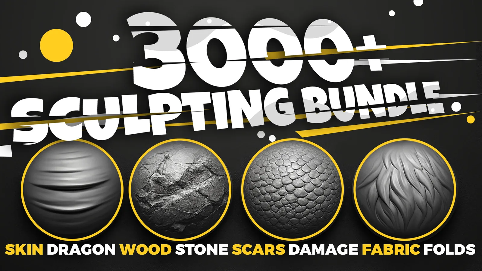
Main brush library
3000+ Sculpting Brushes Bundle
Use a compact sculpting UI to browse custom brushes when needed, then return the viewport to full focus for real form decisions.
View the bundle